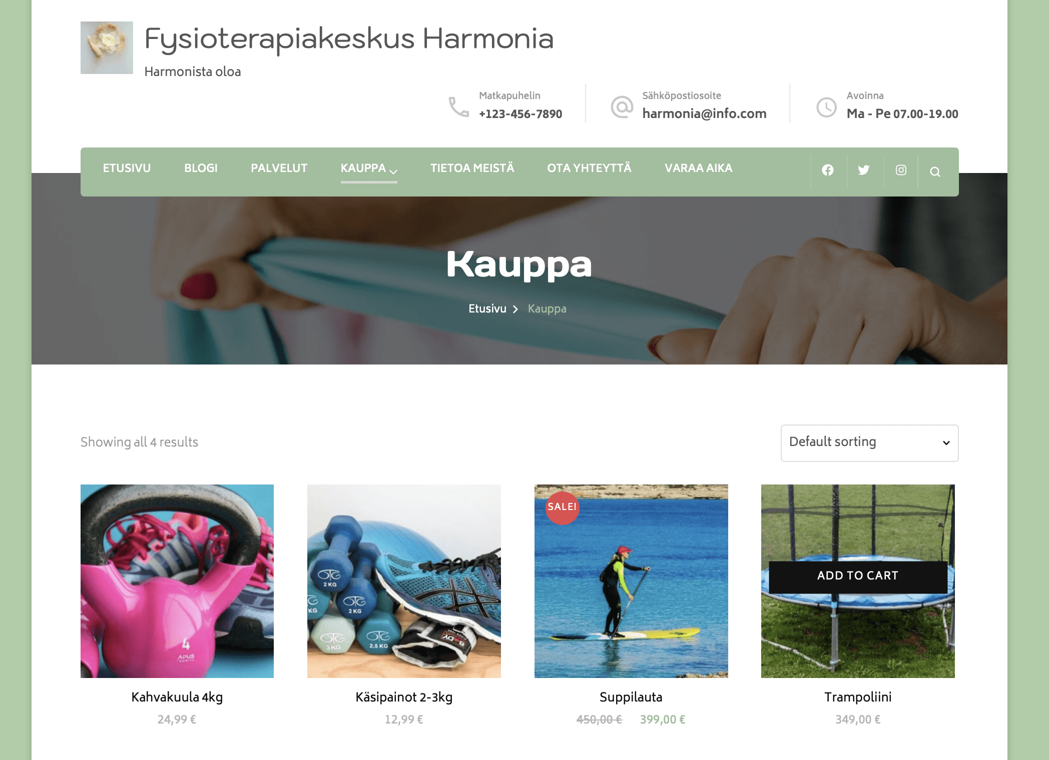
Physiotherapy Site
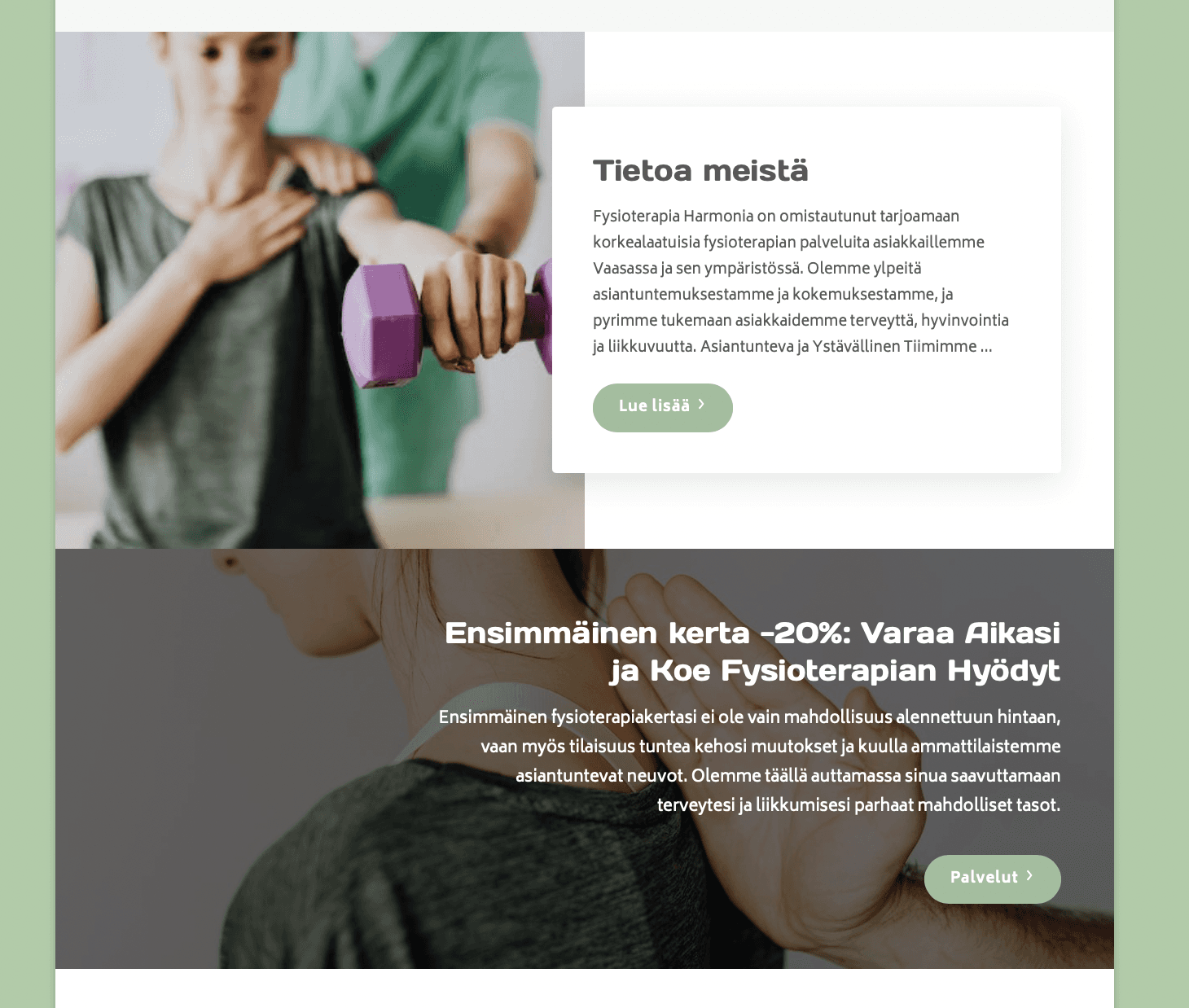
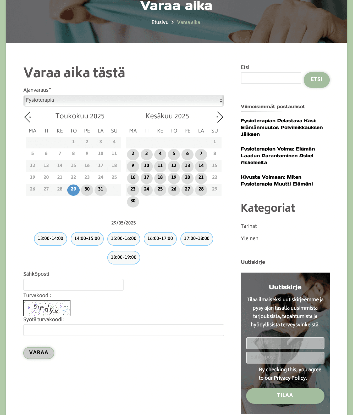
The goal of this project was to design and develop a physiotherapy website that combines clarity, accessibility, and a calm visual identity. The purpose was to create an online presence that reflects the values of well-being, trust, and professionalism, while also providing practical tools for clients to explore services, shop for products, and book appointments easily. The site was implemented using WordPress and styled with a custom green, white, and gray color palette to convey harmony and balance.
Design Process
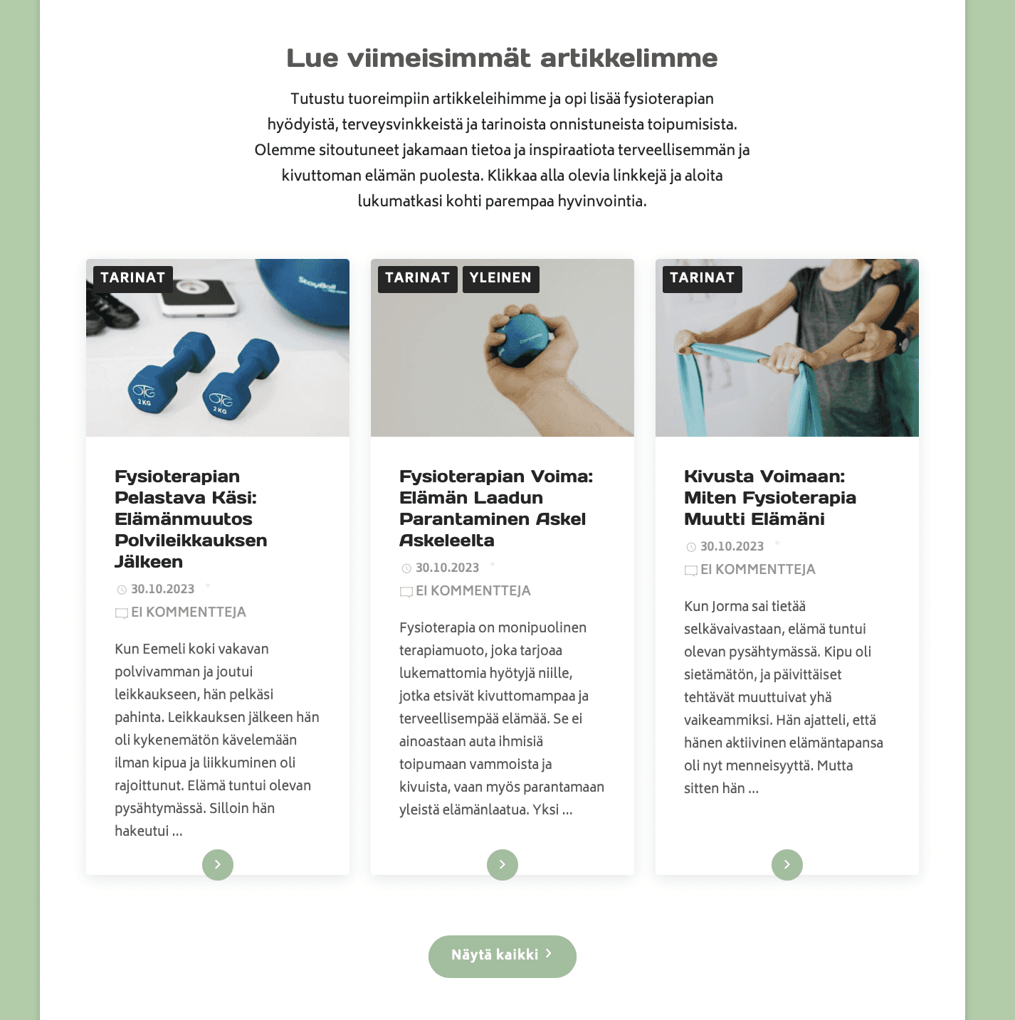
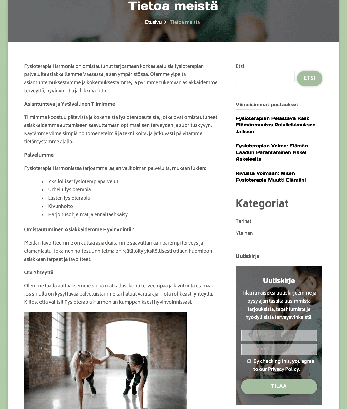
I approached the design from a user-centered perspective, considering how visitors would navigate the site, find information about services, and contact the physiotherapy practice. I started by sketching wireframes for the main pages, including the homepage, services page, and contact page. I chose a clean and calming color palette to reflect the health and wellness theme, and ensured that the typography is clear and readable.
The interface was designed to be intuitive, with easy-to-use menus, clear headings, and visually appealing call-to-action elements. I tested the design to ensure consistency, accessibility, and responsiveness across different devices. The result is a professional and engaging website that meets both the client’s needs and the users’ expectations.
Physiotherapy Site
The goal of this project was to design and develop a physiotherapy website that combines clarity, accessibility, and a calm visual identity. The purpose was to create an online presence that reflects the values of well-being, trust, and professionalism, while also providing practical tools for clients to explore services, shop for products, and book appointments easily. The site was implemented using WordPress and styled with a custom green, white, and gray color palette to convey harmony and balance.
Design Process
I approached the design from a user-centered perspective, considering how visitors would navigate the site, find information about services, and contact the physiotherapy practice. I started by sketching wireframes for the main pages, including the homepage, services page, and contact page. I chose a clean and calming color palette to reflect the health and wellness theme, and ensured that the typography is clear and readable.
The interface was designed to be intuitive, with easy-to-use menus, clear headings, and visually appealing call-to-action elements. I tested the design to ensure consistency, accessibility, and responsiveness across different devices. The result is a professional and engaging website that meets both the client’s needs and the users’ expectations.